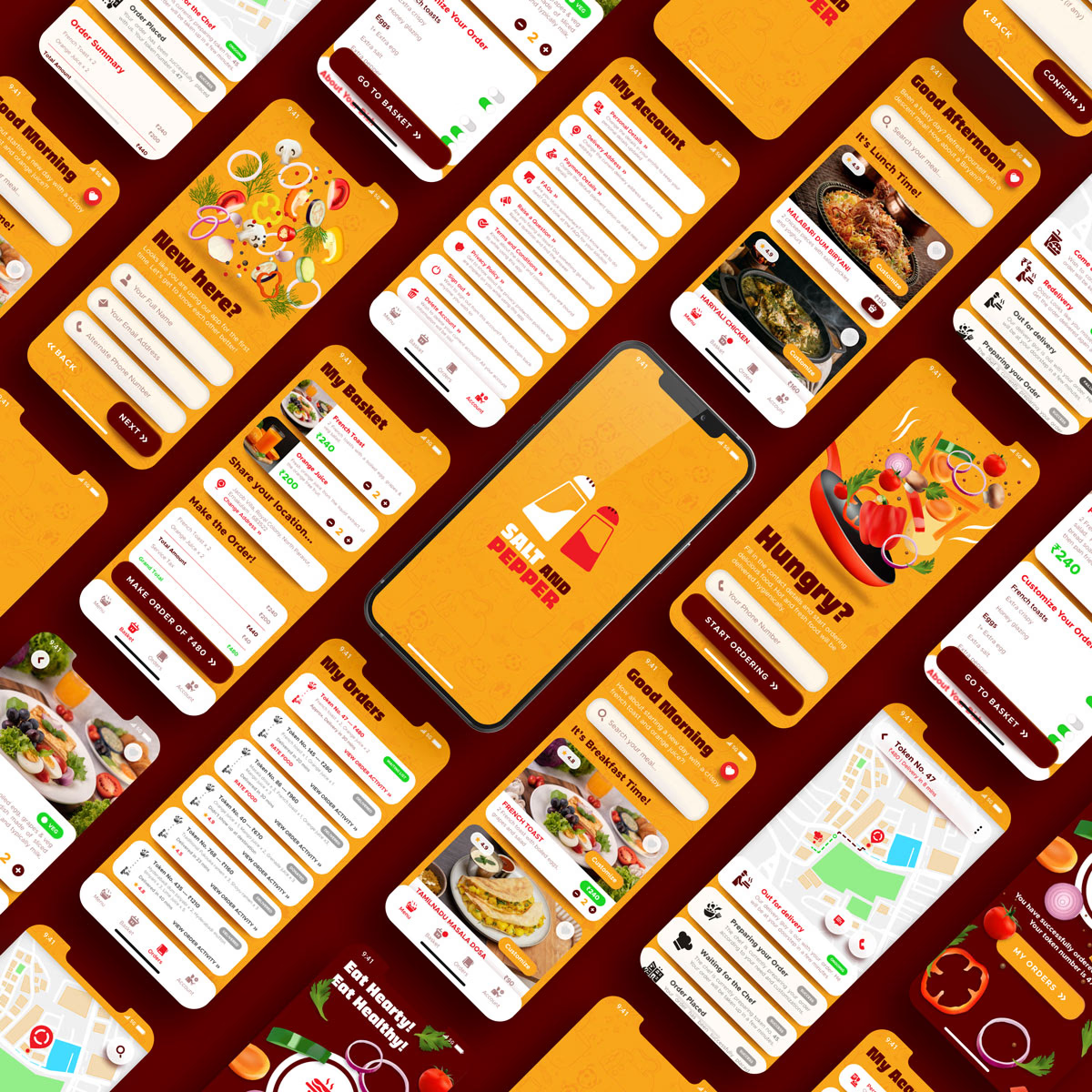
Salt and Pepper
UX Strategy & Design Demo for a Multi-Outlet Restaurant App
Role
UX Strategist & Product Designer
Timeline
6-8 weeks
Tools
Figma, Adobe Illustrator, Google Forms
Category
FoodTech, E-Commerce, UX Strategy
The Problem
What needed to change?
Over-reliance on third-party delivery platforms was eroding customer loyalty and operational control for Salt and Pepper, a multi-cuisine chain based in Kochi.
The brand lacked a dedicated digital touchpoint that could deliver a personalized, multi-outlet dining experience. This resulted in fragmented customer data, missed upselling opportunities, and a lack of real-time visibility into delivery operations. The challenge was to build a native platform that projected brand authority while solving the technical complexities of cross-outlet logistics.
My Responsibilities
- Strategic UX Research: Conducted deep-dive user research and persona creation to identify core friction points in the existing ordering journey.
- Architecture & Flow Planning: Engineered the UX strategy and information architecture to support seamless multi-outlet navigation.
- End-to-End Design: Advanced the product from initial low-fidelity wireframes to a high-fidelity, interactive design system.
- Functional Innovation: Defined a distinct "vibe" and visual language that differentiated the app from generic food aggregators.
- System Design: Designed robust fallback systems to ensure operational continuity during high-demand or delivery failures.
The Approach
How we got there.
Discovery
- User Intelligence: Conducted interviews and feedback analysis from both dine-in and online delivery users to map behavioral patterns.
- Friction Identification: Pinpointed critical pain points in existing market apps, including lack of real-time order clarity and poor fallback options for out-of-stock items.
- Persona Calibration: Created targeted personas, Anjana (Status Transparency), Joseph (Delivery Speed), and Reba (Calorie-Awareness), to guide feature prioritization.
Strategy & UX
- Value Differentiation: Shifted away from generic food search toward a personalized experience focused on user control and "well-timed" interactions.
- Three-Pillar Feature Set: Developed the UI around Awareness (Live Status), Control (Fallback Options), and Feedback (Institutionalized Learning).
- Dynamic Menu Systems: Implemented a "Dynamic Time-Based Menu" that automatically adjusts based on the time of day, reducing decision fatigue.
- Transparency Engine: Introduced "Token-Based Real-Time Tracking" to provide granular updates from prep-to-doorstep.
Delivery & Iteration
- Interactive Prototyping: Built a high-fidelity, clickable prototype to simulate complex user flows, including multi-location selection and tracking.
- Collaborative Validation: Conducted peer review sessions and self-testing to refine the spatial system and overall usability.
- Benchmarking Excellence: Refined the interface based on best-in-class UI benchmarks from global food-tech leaders like Zomato and Swiggy.
The Outcome
Results that speak.
By prioritizing operational control and user clarity, the design concept demonstrated significant potential for business impact:
- Friction Reduction: Achieved a 40% reduction in user search time during simulated testing through the dynamic menu system.
- Order Efficiency: Simulated results showed a 2.5x higher response rate to immediate menu prompts compared to standard lists.
- Engagement Growth: Recorded a 7-15% increase in conversions for health-conscious users through integrated calorie awareness.
- Operational Stability: Successfully recorded potential order drop-offs reduction by 12-18% in high-traffic urban scenarios by implementing smart fallback options.
Full Case Study